On test server
Meine Wildnis ...
Ich bin nicht alleine
Bergmannsgeleucht
Blick nach Osten ...
Winterschneeball
Die Moornixe...
Feierliche Eröffnung ....
Mosel-Höhenweg
Mosel-Höhenweg
Blick auf Beilstein
Abstieg
Beilstein...
Blick zur Ruine Metternich
Burgruine Metternich
Blick auf Ellens-Poltersdorf
Blick nach NO auf Bruttig...
Zeitzeichen
Blick übers Ruhrtal ...
Am Steinbruch
Am Bastenberg
Am Bastenberg
Bahnhof Meschede
Xavers Ranch
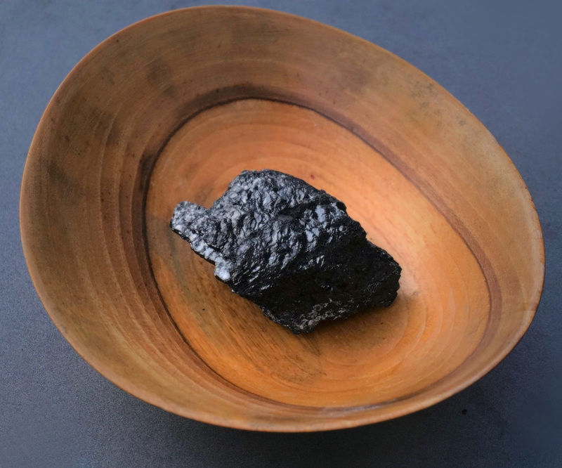
Kohle
Nippfiguren
Nippfiguren
Lotti und Susi...
Lissi und Luzi
Meine Kätzchen...
Luzi, Lissi und Kati
Lissi und Luzi
Lissi und Luzi
Lissi und Luzi
Eine Schöpfung...
Der Bücherwurm
DSC00245
Vater war Schreiner
Schulter
Kragen
Kopf
Tänzerin aus Meißen
DSC00252
Eine Tänzerin...
Eule...
Vom Schöpfer auf den Präsentierteller
1/250 • f/5.6 • 122.0 mm • ISO 500 •
SONY ILCE-6000
E 55-210mm F4.5-6.3 OSS
See also...
Keywords
Authorizations, license
-
Visible by: Everyone -
All rights reserved
-
102 visits
Kohle – besser so?


Fred Fouarge, Erika+Manfred, WiePet, * ઇଓ * and 4 other people have particularly liked this photo
- Keyboard shortcuts:
Jump to top
RSS feed- Latest comments - Subscribe to the comment feeds of this photo
- ipernity © 2007-2025
- Help & Contact
|
Club news
|
About ipernity
|
History |
ipernity Club & Prices |
Guide of good conduct
Donate | Group guidelines | Privacy policy | Terms of use | Statutes | In memoria -
Facebook
Twitter
Das Untere finde ich gut.
Ruesterstaude club has replied to Kalli clubStopping down a bit further and reducing the ISO range even more would have produced a slightly better result. But that's only in passing and as an answer to your question.
Apart from the technical aspects, I like both images very much.
The upper one especially because of the wonderful mood it gets from the light.
If you wanted to work out even more depth of field and detail, maybe stacking such a photo would be worth a try for you?
Ruesterstaude club has replied to * ઇଓ * clubViele Grüße und danke noch einmal,
Volker
* ઇଓ * club has replied to Ruesterstaude clubFocus stacking from the beginning to the end of the subject is not mandatory either. A beautiful sharpness gradient has its charms.
Before you try it, I would encourage you to try it with the recommended stopping down and lower ISO value. If you are satisfied with the results, you might want to try focus stacking. But please, don't put any pressure on yourself.
According to initial research, Corel doesn't seem to offer a useful focus stacking function. However, there are free focus stacking programs as well as paid ones. If you feel up to it and want to try it, you can find hints on the Internet.
Ruesterstaude club has replied to * ઇଓ * club* ઇଓ * club has replied to Ruesterstaude clubSign-in to write a comment.