On test server
See also...
Authorizations, license
-
Visible by: Everyone -
All rights reserved
-
619 visits
this photo by Marko Novosel

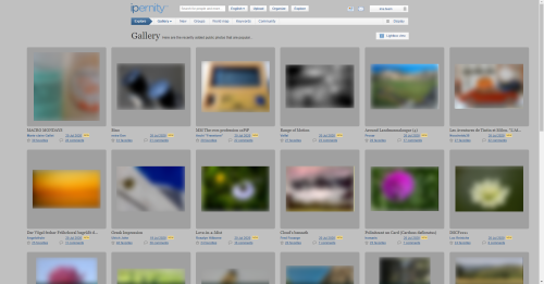
Alternative proposition for front page.
I used a little from everybody,from old ipernity,from Bernhard,from other fotosharing places and some was even from me.
That button in the middle is for the Ipernity story what i hope somebody will write one day.
So what do you think?
I used a little from everybody,from old ipernity,from Bernhard,from other fotosharing places and some was even from me.
That button in the middle is for the Ipernity story what i hope somebody will write one day.
So what do you think?
Risa Profana, Ruebenkraut, Andy Rodker, Sami Serola (inactive) and 3 other people have particularly liked this photo
- Keyboard shortcuts:
Jump to top
RSS feed- Latest comments - Subscribe to the comment feeds of this photo
- ipernity © 2007-2025
- Help & Contact
|
Club news
|
About ipernity
|
History |
ipernity Club & Prices |
Guide of good conduct
Donate | Group guidelines | Privacy policy | Terms of use | Statutes | In memoria -
Facebook
Twitter
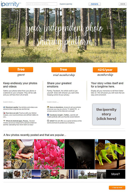
my perspective from having viewed this on a laptop:
- i like the news button not being orange (good call)
- i like the ipernity story button idea
- i like the three button clean layout
- love the 'your independent photo sharing platform' over the photo!
- i like having the grouped photos at the borrom
reservations:
- it looks to me, based on how this is layed out, that the 'Keep...', 'Share...', and 'Your Story' paragraphs are descriptions of each of the buttons they are under. somehow visually it needs to be clear that those are about ipernity as a member, not as a guest.
* maybe if there was a full line delineator under the buttons that would do it.
- i don't know if it is a good idea to have the price on the frontpage. maybe it is, but i wonder about it.
This smartphone inputs are very good,seems there should be less pictures,probably two,one on left,one on right.
Ill try to do it tommorow.
I like how we talk about it here and there,its very important.
My opinion on background color I have already expressed, but I say it again. We could be proud of having a different, white and lighter start page ;-)
In general I think the best way is to combine both, the suggestion made by Bernhard and this. And not to make too "dramatical" changes on what comes to colors and style.
Most important in my opinion is to make clear what are the functions! We should pretty soon know how the guest, trial and member accounts work. That can turn out surprisingly difficult and time consuming task to implement those features into an existing database. Once we know what the user roles would be, then it is also easier to define what texts and buttons should be there on front page.
I agree on minimalistic approach,sentences should be at the end or moved out.
Key is not to go into too dramatic changes and to keep our identity.
Sign-in to write a comment.