

Dear members and friends of ipernity!
1) As announced last Friday, we have now released the trial version with the extended display options. At first it is only available in the English version, so that you can compare the previous and the new version by changing the language. As always, we ask for constructive optimization suggestions.
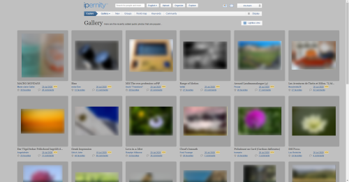
The current changes only affect the “Photos” page (both your own and other members'), and the display options for them. The left hand panel was moved to a drop-down position to provide the necessary space and give a more harmonious overall look.:

∎ For medium sized images, this allows for the balanced widescreen layout.
∎ For medium and large sized images, this allows for the options of frames.
(Of course “no frame” is kept as an option.)
∎ Large images are no longer cramped between a left panel and the statistics.
∎ There is room for more small images, with improved spacing.
∎ For medium and large sized images, this allows for the options of frames.
(Of course “no frame” is kept as an option.)
∎ Large images are no longer cramped between a left panel and the statistics.
∎ There is room for more small images, with improved spacing.
2) We are happy to include a reference from our member Thomas Heizmann to a non-profit photo competition in our Newsflash. The motto is "Helping Hands" and it will run until 15 September 2020.
▶️ Click here for the photo competition.
Your ima team
[FR]
Chers membres et amis d'ipernity !
1) Comme annoncé vendredi dernier, nous avons maintenant lancé la version d'essai avec les options d'affichage étendues. Dans un premier temps, elle n'est disponible que dans la version anglaise, afin que vous puissiez comparer la précédente et la nouvelle version en changeant de langue. Comme toujours, nous demandons des suggestions d'optimisation constructives.
Les modifications actuelles ne concernent que la page "Photos" (la vôtre et celle des autres membres) et les options d'affichage de celles-ci. Le panneau de gauche a été déplacé en position déroulante pour fournir l'espace nécessaire et donner un aspect général plus harmonieux:
∎ Pour les images de taille moyenne et de grande taille, cela permet de choisir des cadres. (Bien entendu, "pas de cadre" est conservé en option.)
∎ Les images de grande taille ne sont plus à l'étroit entre un panneau gauche et les statistiques.
∎ Il y a de la place pour des images plus petites, avec un meilleur espacement.
2) Nous sommes heureux d'inclure la référence de notre membre Thomas Heizmann à un concours photo à but non lucratif dans notre Newsflash. La devise est "Des mains qui aident" et elle sera en vigueur jusqu'au 15 septembre 2020.
▶️ Cliquez ici pour le concours photo.
Votre équipe ima
[DE]
Liebe Mitglieder und Freunde von ipernity!
1) Wie am vergangenen Freitag angekündigt, haben wir jetzt die Testversion mit den erweiterten Display-Optionen freigeschaltet. Sie ist zunächst nur in der englischen Version verfügbar, damit ihr durch Wechsel der Sprache die bisherige mit der neuen Version vergleichen könnt. Wie immer bitten wir um konstruktive Optimierungsvorschläge.
Die aktuellen Änderungen betreffen nur die Seite "Fotos" (sowohl eure eigene, als auch die der anderen Mitglieder), sowie die Anzeigeoptionen dafür. Die linke Menü-Tafel wurde in eine Dropdown-Position verschoben, um den erforderlichen Platz zu schaffen und ein hamonischeres Gesamtbild zu erzielen.
∎ Bei mittelgroßen und großen Bildern ermöglicht dies die Rahmen-Option.
(Selbstverständlich wird "kein Rahmen" als Option beibehalten.)
∎ Große Bilder werden nicht mehr zwischen einer linken Menü-Tafel und der Statistik eingezwängt.
∎ Es gibt Platz für mehr kleine Bilder, bei gleichzeitig verbesserten Abständen.
2) Gern nehmen wir den Hinweis unseres Mitglieds Thomas Heizmann auf einen gemeinnützigen Fotowettbewerb in unseren Newsflash auf. Er steht unter dem Motto "Helfende Hände" und läuft noch bis zum 15. September 2020.
▶️ Hier geht es zum Fotowettbewerb.
Euer ima-Team
Fred Fouarge club has added(es gibt im übrigen einen LapTop und einen Beamer zu gewinnen)
It really shows off everyone's photos better. And easy to find and use the drop-down. It's laid out very naturally.
So awesome that the team has allowed for options in the changes. Sometimes I'm in the mood for a frame or wide screen, sometimes I'm not! Now I can be fickle and still have it my way!!
This is much better. A definite improvement. Thank you.Take back what I said. I've just realised that this new layout is for my eyes only and not displayed to people viewing from outside Ipernity. So it's pretty pointless really.
Sami Serola (inactiv… club has replied to Isisbridge clubTeam club has replied to Isisbridge clubraingirl club has replied to Isisbridge clubThe change made here is two fold. The ability to go to wide screen and have frames, etc - in otherwords, the display options are just for members. However, the move of the left panel to a drop-down box is for anyone, members and outside viewers. I think this is the most important change and it does benefit the outsdie viewer in a big way. The left panel was clunky - now the photos are prominent and the page looks much cleaner and appealing.
As to wide screen and frame options - if an outside viewer doesn't like the narrow page, they will see by trying the display button that members do have the option. I think that's a good thing.
raingirl club has replied to Sami Serola (inactiv… clubIsisbridge club has replied to raingirl clubWhat I meant is that the page looks untidy with the images aligned from the bottom. The creator has the option of correcting this by using the frames in the display panel, BUT this can only be seen by oneself The outsider viewer still sees the untidy version!
Same problem with the descriptions. The creator has the option of displaying the descriptions directly under the titles. But the outside viewer still sees them adrift.
Jaap van 't Veen club has replied to Isisbridge clubraingirl club has replied to Bergfex clubXata club has replied to Bergfex clubA splendid improvement ***************
Obrigada Team
But I have absolutely no idea! What does 'extended display options' atually mean?
Apologies for my techie ignorance,
Bergfex club has replied to Andy Rodker clubYou can find information about the display options you have in this former Newsflash in point 2:www.ipernity.com/blog/team/4732054
Subsequent information about the temporary interruption of the upload function the day before yesterday:
By the standards of the IT world, Ipernity is a rather ancient program that uses a server architecture which is also long outdated. It consists of 18 different machines, located at the Amazon Web Service. One of them is the so called "gateway server".
As part of our efforts to bring ipernity to a technical up-to-date level, this gateway server had an unexpected reaction. Such things can happen, especially because we did not program the software ourselves and therefore do not know it in all dimensions.
In such cases it does not make sense to send us tickets or iper-mails. After all, we are confronted with the error within seconds and have enough stress with fixing it. In such situations we hardly have time to answer everything.
Please just be patient and give us the necessary peace to work. You can be sure that we are always working hard in the background to re-establish the error-free operating state.
Thanks for your understanding.
raingirl club has replied to Team clubLeon_Vienna club has replied to Team clubAuch wenn man ipernity liebt und schätzt: es gibt doch auch noch andere Sachen zu tun, oder? Seid doch mal ein bisschen flexibel! Eine Tasse guten Tee/Kaffee, ein Stück Kuchen, eine Runde durch den Garten oder den Park, ein nettes Gespräch mit dem Nachbarn - und die Freude darüber, dass sich manche Probleme nach einer Weile "von selbst" gelöst haben.
Danke ima.team für eure Arbeit im Hintergrund, ich für meinen Teil habe gar nichts gemerkt!
Xata club has replied to Team clubraingirl club has replied to HappySnapperthe funny thing is that the dropdown analysis options have always been there for us to use (they were in the panel that was always visible on the left before this change), but like you, i hadn't been using them. now i feel drawn to make use of them even though they aren't out in the open!
I am looking at adding "Favorites" to the main menu to the right of Contacts, but keeping it in the drop-down menu. An advantage of "testing" the English version first, is that the coding for this addition can be done on the English version now, before all the edits to 16 html files are transposed to the other languages. Because from the responses here, and lack of (major) negative ones, it seems this update has overall approval.
I do not think the new drop-down is an added complication, especially for casual visitors, as it is more in line with many other web sites. I think it correct to keep the adjustable layout feature for Standard Club members. But this update does benefit Guests, and non-widescreen users, with the layout of the normal 3 photos per row, which is now balanced due to increased spacing and absent left panel. But we do have the idea of making the open frame as the default view for Guests, while the restriction is that the personal selection is not possible.
Bergfex club has replied to Rob Stamp clubXata club has replied to Rob Stamp clubKalli club has replied to Rob Stamp clubSpo has replied to Rob Stamp clubIn the name of consistency, should the articles and docs get the same treatment, their own faves (favorite articles, favorite docs) in the main menu?
raingirl club has replied to SpoOn the other hand, keeping a 'favorites' photo tab up on the top menu next to 'Contacts' could be nice.
Spo has replied to raingirl clubSemantically coordinate "photos" and "favorites" items in the 'breadcrumb' menu may be slightly troublesome if the viewer doesn't fully comprehend that they are looking at particular user's menu with that user's OWN photos, faves, docs etc. If they expect the menu item "photos" to contain photos in general, then they'd expect faves to be underneath "photos", as a subset of it, not coordinate to it.
But this is somewhat nitpicking. Users will get used to what they'll find inside favorites anyway.
Maybe you have found it by now, but perhaps it is somewhat less than obvious, when you have been used to the left hand panel, and the only indicator of the new location is the triangle on the bold "Photos" in the horizontal menu.
Amelia club has replied to Rob Stamp clubIt is quite common to ask for feedback from club members in particular. After all, they pay for the operation of ipernity, whereas guests come and go. Which of the new features will be made available to guests will be decided later by the ima team from a marketing point of view. At this point in time, all that matters is that we develop the best for the club members.
raingirl club has replied to Team clubIsisbridge club has replied to Team clubSami Serola (inactiv… club has replied to Isisbridge clubAnyway, I think we should not make any differentiation on this 'Display' feature. First the idea was, that people not having ipernity standard club account would find it somehow tempting to upgrade, if a feature like 'Display' options are not available. But from marketing point of view, it could also be tempting to visit, use and join ipernity, if such a feature is available.
Isisbridge club has replied to Sami Serola (inactiv… clubFrom a marketing point of view, I would have thought it would be better to have the photo pages looking as nice as possible for visitors, to encourage new users.
Sami Serola (inactiv… club has replied to Isisbridge clubBergfex club has replied to Isisbridge clubWhat is offered to guests and non-registered visitors later, is a completely different thing. There are many criteria for it. A free offer should be attractive, but it must never fulfil all wishes. It has to attract attention, generate interest and the desire to get more - and should ultimately lead to the booking of a subscription. Because without subscriptions a member project like this one can never survive.
This is what distinguishes ipernity from Facebook or Instagram: Facebook counts visitors, not members, because these platforms are funded by advertising. Ipernity needs subscriptions. Otherwise there isn't enough money to pay the monthly operating costs of several thousands Euros.
Isisbridge club has replied to Bergfex clubJaap van 't Veen club has replied to Isisbridge clubI'm sure for 99.99% ima will not change anything.
Spo has replied to Team clubUnderstood, sounds logical to me.
Spo has replied to Bergfex clubAnyway, it looks as if ipernity had an api!
Isisbridge club has replied to Bergfex clubIf the viewer then wants to alter his perception with pink glasses or whatever, that's entirely up to him and not relevant to this discussion. .
raingirl club has replied to Bergfex clubHappySnapper has replied to raingirl clubBecause of the mainly positive feedback, the layout enhancement has now been transferred to all other language versions. If errors or malfunctions are discovered there, please report them. Thank you.
Isisbridge club has replied to Team clubFor photos in an album, in order to get the benefit of the extra space for the improved layout, the left panel would be removed. There is the down side that if a description is added to an album, this would not be immediately in view, nor some statistics, with the menu contents moved to a drop-down position. So maybe the left hand panel becomes a low height, full width panel above the photos, and there would be no drop-down.
Spo has replied to Rob Stamp clubCould the album description be located underneath the title where it now says "Among your albums"? Then the combo would be similar to photos. "Among" thing could be beneath that, if it is needed at all, since it is a link to albums, and breadcrumb menu already has "albums" right above. Awfully long description might be a challenge here, though.
was ich mir noch wünschen würde,
weil ich es sehr nützlich finde.
Ein "Nach-Oben-Button".
Der sollte dann dazu dienen das,
wenn man am unteren Ende einer Seite angekommen ist,
durch einen "Button" der auch erst dann auftaucht,
wenn man an das Ende der Seite kommt, wieder nach oben zu springen zur Menüleiste.
Hat man erst die hälfte der Seite erreicht, muss man noch hoch scrollen,
doch ab einem gewissen "heruntergehen", erscheint dann dieser Icon.
Wie diese Funktion allerdings wirklich heißt und ob das ein Plugin ist,
der hinzugefügt werden kann, weiß ich leider nicht.
Spo has replied to TaorminaTaormina has replied to SpoI have a laptop at work that doesn't have that,
and one that unfortunately never jumps up to the menu bar.
Maybe it's an attitude problem?!
But unfortunately, I have to scroll up a bit.
Spo has replied to TaorminaTaormina has replied to SpoAt least not on my laptops.
But it's just an idea, to implant something like this
permanently for everyone.
Leon_Vienna club has replied to TaorminaWir haben uns dann auf Erweiterungs-Suche gemacht und ich bin mit Scroll-to-Top (https://addons.mozilla.org/en-US/firefox/addon/scroll-to-top/?src=external-mysite) ganz zufrieden. Gibt es bestimmt auch für andere Browser und ist echt eine große Hilfe, wenn man von der Tiefe einer Kommentarliste wieder "auftauchen" will. ;-)
Taormina has replied to Leon_Vienna clubwie gesagt es ist nur eine Idee
und sicher haben die meisten eine andere Möglichkeit.
Ein User hier hat mich darüber informiert,
das solche Plug-in teils kostenlos oder für unter zehn Euro zu bekommen sind.
Was das aber für das Installieren und alles Weitere bedeutet, weiß ich nicht.
Würde man am Ende der Seite, allerdings nur einen "Pfeil" drücken,
der einen wieder... wie du so schön sagst, aus den Tiefen eines solchen Textes
wieder hinauf holt. Würde das vielleicht auch anderen gefallen.
ୱ Kiezkickerde ( ͡°… club has replied to Taorminaraingirl club has replied to ୱ Kiezkickerde ( ͡°… clubI think it's wonderful that we can try to put in options so that as many people as possible will have what they like!
Spo has replied to Rob Stamp clubSomething like 'upwards arrow to bar'?
www.htmlsymbols.xyz/unicode/U+2912
Taormina has replied to Spowhich is very practical given the size of some pages like this one,
for example. But as I mentioned before, there are keys that help...
if you can use them.
Taormina has replied to Rob Stamp clubIt'd be nice to have a site like this even if you don't have other options.
This particular site here is enormously long and maybe it will grow even more.
I think it's a matter of getting used to it.
Whether an arrow like this is left or right then ...
I'd prefer it right because I'm right-handed.
Spo has addedSpo has replied to Gillian Everett clubraingirl club has replied to Spo1) Button to scroll to top. Please find the simple solution of a button
in the footer.[edit] Now modified due to feedback to RSS line (or above 'Facebook' if it is absent)
The button that was initially programmed, did function correctly in a fixed position in corner of screen as the page was scrolled. But there were problems when fully tested internally. Being visible but not too distracting on white background, meant it was hard to see on some colours. Problems with different screen widths and different devices, the button overlapping footer unless it was positioned higher on screen.
2) The user menu at top right now requires a click, now a single wide button, thus avoiding unintended opening due to mouse-over, or being taken "back to your space" with a mistaken click on name rather than the 3 bar icon. With the "Back to your space" option removed, it is still easy to click the ipernity logo for the same link.
3) Links are no longer underlined, but still the same blue and mouse-over affect. Revisions to a few that were grey and easy to mistake as only being information, have been retained.
Spo has replied to Rob Stamp clubraingirl club has replied to Sporaingirl club has replied to Rob Stamp clubBergfex club has replied to Rob Stamp club2) The additional click on the user menu on the top right is advantageous.
3) The missing underlining of links in the Dutch test version contradicts the web guidelines for accessible website design. However, even large websites like Google Search or Wikipedia do not comply with these guidelines. If we opt for this variant (links only blue, not underlined), we should do it consistently throughout ipernity.
In my opinion, all three optimizations can be transferred to the other language versions.
Spo has replied to Rob Stamp clubWhen there is no page selector, there should be a few pixels more space between the button and the footer top borderline so that the button doesn't get associated with the footer. But just two or three pixels will do.
I'm sorry for not being able to photoshop a mockup yet.
raingirl club has replied to Rob Stamp clubSpo has replied to Rob Stamp clubSpo has addedSami Serola (inactiv… club has replied to Spowww.ipernity.com/gp/serola/14074/595b623f
There it would become more easily noticed, and it usually is far enough from other links to avoid accidentally clicking it on touch screens and mobile devices.
Peeps, do notice the use of unique URL as well. It is a good way share illustrated ideas, but not have them on normal photo stream. Instructions for that here:
www.ipernity.com/doc/serola/45718206
Spo has replied to Sami Serola (inactiv… clubTeam club has replied to SpoJaap van 't Veen club has replied to SpoBlijven alle foto's zonder trucs gewoon zichtbaar.
Kalli club has replied to Jaap van 't Veen clubaddons.mozilla.org/de/firefox/addon/scroll-to-top
(The wheel does not actually need to be reinvented.)
For Chrome: chrome.google.com/webstore/detail/scroll-to-top/hegiignepmecppikdlbohnnbfjdoaghj?hl=de
This plug-in has the advantage that you can scroll back up from any position. Just try it out
Spo has replied to Bergfex clubSign-in to write a comment.