

Optical impression:
✅ Wide screen (responsive)
⛔️ Disorderly arrangement
⛔️ Little space between the pictures is annoying when viewing,
⛔️ Portrait format images are disadvantaged to landscape format images
Information:
✅ Image description
⬜ Image title (only visible with mouse over)
⬜ Photographer (only visible with mouse over)
⬜ Number of comments (only visible with mouse over)
⬜ Rating by the community (only visible with mouse over)
⛔️ No publishing date
⛔️ No number of visits
2) 500px

Optical impression:
✅ Wide screen (responsive)
✅ Better distance of the pictures (compared to Flickr)
⛔️ Disorderly arrangement
⛔️ Portrait format images are disadvantaged to landscape format images
Information:
⬜ Photographer (only visible with mouse over)
⬜ Rating by the community (only visible with mouse over)
⬜ Number of visits (only visible with mouse over)
⛔️ No image title
⛔️ No image description
⛔️ No publishing date
⛔️ No number of comments
3) Fotocommunity (very similar to 500px)

Optical impression:
✅ Better distance of the pictures (compared to Flickr)
✅ Better diameters of the pictures
⛔️ No wide screen
⛔️ Disorderly arrangement
⛔️ Portrait format images are disadvantaged to landscape format images
Information:
⬜ Image title (only visible with mouse over)
⬜ Photographer (only visible with mouse over)
⬜ Number of visits (only visible with mouse over)
⬜ Number of comments (only visible with mouse over)
⬜ Rating (only visible with mouse over)
⛔️ No publishing date
⛔️ No image description
4) Fotoforum

Optical impression:
✅ Better distance of the pictures (compared to Flickr)
✅ Portrait format pictures not disadvantaged
⬜ Rather condensed arrangement
⬜ Rather small thumbnails
⛔️ No wide screen setting
⛔️ No background color setting
Information:
⬜ Image title (only visible with mouse over)
⬜ Photographer (only visible with mouse over)
⬜ Number of visits (only visible with mouse over)
⬜ Number of comments (only visible with mouse over)
⬜ Rating (only visible with mouse over)
⛔️ No publishing date
⛔️ No image description
5) c't Fotografie (Heise online)

Optical impression:
✅ Neat, tidy arrangement
✅ Better distance of the pictures (compared to Flickr)
✅ Portrait format pictures not disadvantaged
⛔️ No wide screen setting
⛔️ Background color not ajustable
Information:
✅ Image title
✅ Photographer
✅ Date of publishing
⛔️ No image description
⛔️ No number of comments
⛔️ No rating by the community
⛔️ No number of visits
The large format presentation has the disadvantage that there are fewer clicks to the photographers' original pages. Against search engine operators such as Google or Bing was successfully sued. With sharing sites this legal problem does not exist, but the reduced traffic to the photographer accounts is not pleasant.
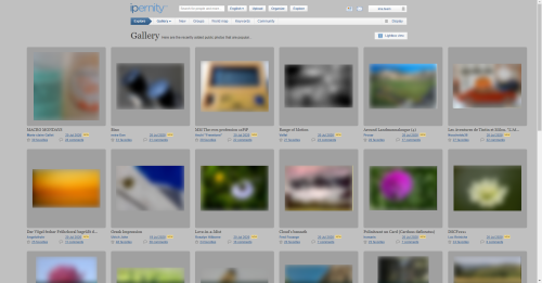
6) ipernity
")
Optical impression:
✅ Neat, tidy arrangement
✅ Better distance of the pictures (compared to Flickr)
✅ Portrait format pictures not disadvantaged
✅ Wide screen setting
✅ Background color adjustable (⭐ unique feature)
✅ Previews adjustable: unframed / framed / mounted (⭐ unique feature)
Information:
✅ Image title
✅ Photographer
✅ Publishing date
✅ Number of comments
✅ Rating by the community
⛔️ No image description
⛔️ No number of visits
_______________________________
7) Google

Optical impression:
✅ Better distance of the pictures (compared to Flickr)
✅ Wide screen (responsive)
⬜ Rather small thumbnails
⛔️ Portrait format pictures disadvantaged
Information:
✅ Link to the source
⛔️ No image title
⛔️ No image description
⛔️ No photographer
⛔️ No date of publishing
⛔️ No number of comments
⛔️ No rating by the community
⛔️ No number of visits
8) Bing (non-competitive, no sharing community)

Optical impression:
✅ Better distance of the pictures (compared to Flickr)
✅ Wide screen (responsive)
✅ Improved optical separation by framing
⬜ Rather small thumbnails
⛔️ Portrait format pictures disadvantaged
Information:
✅ Link to the source (can be switched off)
✅ Image title (can be switched off)
⛔️ No image description
⛔️ No photographer
⛔️ No date of publishing
⛔️ No number of comments
⛔️ No rating by the community
⛔️ No number of visits
___________________________________________________________________
▶️ In the meantime Falk Preusche has made this comparison available as a very clear Excel table.
Klasse werk Rob !!
Fred Fouarge club has replied to Jaap van 't Veen clubFred Fouarge club has addedEs müsste die Möglichkeit geben, sie zu veröffentlichen!
Ich bin echt sehr froh, dass wir hier immer die Möglichkeit hatten, mitzuentscheiden...
Danke auch heute wieder:)
Bergfex club has replied to Tanja - Loughcrew clubAm liebsten wäre mir, wenn wir daraus einen 3.minütige Youtube-Film machen könnten. Das wäre zeitgemäß und würde mehr Menschen erreichen, als irgendeine Schriftform. Wir könnten das auch zu anderen Themen machen. Mir fehlt nur die Zeit und ein(e) passende(r) Moderator(in), die/der das fotogen präsentiert. Ich als Pensionist komme dafür wohl kaum in Frage.
Tanja - Loughcrew club has replied to Bergfex clubMüsste es moderiert werden und wenn ja, warum?
Ich persönlich würde mich für die reinen Fakten interessieren und eben auch für eine
Gegenüberstellung!
Ich weiß nicht ob es ratsam ist, aber Du „kennst“ mich ja...mich interessiert zudem eben
auch das Miteinander...der soziale Aspekt!
Wäre toll, wenn so eine Aufstellung bei einer Suche sofort auftauchen würde...ob es so gestattet ist, muss ich mir hier erstmal rauslesen :)
Frohe Pfingsttage Euch!
Bergfex club has replied to Tanja - Loughcrew clubSchau mal: www.youtube.com/watch?v=FjaCcbW0KX8
Über 100.000 mal geklickt.
Der Typ hat 393.000 Abonnenten.
If it's not just about viewing photos, but also about their photographer and management options, ipernity certainly offers better options than all other platforms presented for comparison.
The options currently "under construction" (ipernity /"What's hot!") allow individual settings according to personal needs and/or preferences and give hope.
Seen through the eyes - especially those of the admin of the group "Ipernity Frontpage & What's Hot!", some data to the photo are essential and a prerequisite for my work. It is therefore excellent ipernity makes a clear difference also in this area and offers an advantage compared to other photo platforms.
But a somewhat worried question on the side. Have the photographers and/or platforms approved the copying of the photos and/or layouts for comparison purposes?
Bergfex club has replied to * ઇଓ * clubRechtsanwalt Dr. Schwenke schreibt dazu: "Screenshots sind keine „Licht“-Bilder (das heißt nicht mittels Strahlentechnik erstellt) und daher nicht urheberrechtlich geschützt. Sie dürfen daher ohne Rückfrage verwendet werden." (Stand Februar 2020)
Und weiter: "Bilder darf man zwar ganz übernehmen, aber auch hier muss das Bild als Beleg für geistige Ausführungen notwendig sein. Das ist zum Beispiel bei ... Screenshots von Websites zwecks deren Rezension zulässig."
Ferner zeigen die Screenshots keine Originale, sondern nur automatisch generierte Vorschaubilder. Dies ist laut Dr. Schwenke "... eine übliche und vom Urheber, der seine Bilder im Internet verbreitet, hingenommene Nutzung."
Ich denke deshalb, dass mein Review kein Copyright verletzt, lasse mich aber gern eines Besseren belehren, wenn ich den zitierten Artikel falsch verstanden haben sollte.
* ઇଓ * club has replied to Bergfex clubQuote "gemäß § 51 UrhG sind Bildzitate erlaubt, wenn sie als Beleg für eine geistige Auseinandersetzung notwendig sind. "
Question: Are the pictures on the platforms shown here the subject of intellectual debate?
The sentence you quoted in parts about the admissibility of quoting (copying/sharing) an "automatically generated preview image" refers to the sharing of posts in "social media - for example Facebook, Twitter, XING or social bookmarking services" ( Dr. Thomas Schwenke).
Question: Is ipernity an officially recognized part of this?
Excerpt from the summary by Dr. Thomas Schwenke:
"Ein zulässiges Bildzitat ist eine seltene Ausnahme."
""Vorschaubilder und -texte in Social Media bergen kaum Probleme."
Last question: Is the legal situation in your adopted country identical to that in Germany - and does it coincide with international and ultimately French copyright law?
I don't want to lecture you, but rather give you the opportunity to examine the facts of the case again in detail to provide you with sufficient legal security, as the devil is in the details.
Bergfex club has added* ઇଓ * club has replied to Bergfex clubThe corrections made so far are a good start, and of course, I'd like to give you a few days time. We'll keep in touch.
Team club has replied to homaris clubhomaris club has replied to Team clubTeam club has replied to homaris clubI really like how the wide screen on Explore looks right now! Photos go all the way out to the left and right edges of my screen.
fyi (and this may be just on my particular screen) - a single page of wide screen Explore page has 27 photos. It shows 5 lines of 5 photos and then the 6th line has only 2 photos. Perhaps this is just my screen, like I said, but I thought I'd let you know. Doesn't bother me, just seemed a tad inconsistant.
Wide screen on my own photo page in wide screen doesn't have this issue, it shows 3 complete rows of 4 photos for a total of 12 per page.
Again - these aren't complaints, just pointing out stuff in case you didn't happen to know about them.
The one in this case was due to wanting to trial the different framing styles, by making use of the fact that there are separate files for each language. So most had the 2 pixel frame, on most pages, while only in Explore, there was no frame for English, and the German had the filled in 'slide mount' version, because the concept originated from an idea by Bernhard.
The calculated number of photos that will fit, multiplied by 3 (not 2 as in an earlier phase), results in complete rows. But not Explore, it insists on returning pages of 27 (3x9), I have not been able to intervene as with the others. I would very much like to solve it, but suspect it is due to the scoring algorithm, and the photos are not a fixed sequential selection from the database. But no problem, you just need a monitor with 2400 horizontal resolution, to fit 9 per row.
Ik moet zeggen dat na het vergelijken van 'nieuw' en 'oud' ik toch de oude lay-out prefereer. Doordat de foto's aan de onderkant met elkaar lijnen, geeft dat een veel rustiger beeld. Zeker in combinatie met de tekst er onder. In de nieuwe lay out ziet de presentatie van de foto's er rommelig uit. Ga dit ook niet gebruiken.
Leon_Vienna club has replied to Falk Preusche clubGroßartig!
*****
Vielleicht kann Bernhard den Link irgendwo "prominenter" unterbringen.
Bergfex club has replied to Leon_Vienna clubLeon_Vienna club has replied to Bergfex clubBergfex club has replied to Leon_Vienna clubThe bottom alignment of photos in the old '3 per row' for Explore, What's Hot, is actually a change from what was top alignment. Here it works well with there always being 4 lines of text, as no description is included. For a comparson, on "Your latest photos" for example, the top alignment has not been changed.
The title is only one line, because long ones are truncated, but this is badly done based on number of characters. This allows for titles in capitals, when in many cases there is space. I will improve this.
Thank you for all the feedback. An initial development step was to try with the images centralised, just left to right at first, and to improve the look did indeed lead to the addition of an outline frame. With the two framing styles now being selectable options, which do require the images to be centralised, leads me to agree that for the "no frame" option, the photos should be bottom and left aligned.
:-)))
Sauf sur un point :
Quand j'ouvre mes photos "les plus appréciées", plusieurs photos de la page 1 sont répétées sur la page 2 et le même phénomène se reproduit à chaque page.
C'est très énervant et ça augmente considérablement le nombre de pages.
:-(((
Ich sehe da drei Kästchen mit unterschiedlichen Blautönen, die sich willkürlich in der Reihenfolge verändern, wenn ich auf eines davon klicke. Bei meinen Bildern verschwindet der Rahmen, das ist schön - aber ich kriege nur durch herausprobieren heraus, wofür ich da wo hin klicken muss. Das ganz linke Kästchen ist nicht anklickbar.
OK. Nach _viel_ probieren habe ich nun verstanden, dass das linke Kästchen den aktuellen Stand anzeigen soll, und das das rechte Kästchen darstellen soll, dass meine Fotos einen grauen Hintergrund bekommen und das mittlere, dass dieser graue Hintergrund ausgeblendet wird. Aber das ist so überhaupt nicht verständlich, dann arbeitet doch lieber mit textlichen Beschreibungen anstatt diesen komischen, verschieden blauen Kästchen - zumal mein Hintergrund überhaupt nicht blau ist.
Gut. Ich nehme dann die ganz linke option.... wie gesagt, mich stören die Rahmen oder Hintergründe bei meinen Fotos.
Bergfex club has replied to ୱ Kiezkickerde ( ͡°… clubWenn man schaut, wie weit wir seit der ersten Präsentation der neuen Option schon gekommen sind, hat sich die interaktive Vorgehensweise, bei der alle Meinungen einfließen, ganz gut bewährt. Und was die Option von Rahmen oder Passepartouts betrifft: Die Idee entsprang aus der Diskussion hier, die Geschmäcker sind verschieden. Deshalb soll es ja einstellbar sein. Deine Präferenz soll natürlich in Deinen persönlichen Einstellungen gespeichert werden.
Bergfex club has addedBergfex club has replied to Isabelle Barruhet clubBergfex club has replied to raingirl clubYou can do this directly with Rob via Discord. As you know, you can also easily upload your screenshots there. Here such subtleties would go beyond the scope of this discussion.
raingirl club has replied to Bergfex clubraingirl club has replied to Rob Stamp clubBergfex club has replied to Blue rubber octopus club"photo sharing vs. photo storage (Blue rubber octopus) That's the difference!
raingirl club has replied to Blue rubber octopus clubBerny club has replied to Blue rubber octopus clubBerny club has replied to Bergfex clubBergfex club has replied to Berny clubGoogle löst dieses Problem ansatzweise, indem Landscape seitlich etwas beschnitten wird. Noch besser war die ehemalige Methode der Fotocommunity, quadratische Vorschaubilder zu zeigen, bei denen der Fotograf während des Uploads den Bildschwerpunkt bestimmt hat. Die Aufgabe dieses Konzepts hat vor 4 Jahren einen Shitstorm innerhalb der FC_Community ausgelöst. Aber weil man offensichtlich den Programmcode von 500px lizensiert hatte, war eine Rückkehr wohl nicht möglich. Für mich war es ein Grund, die FC zu verlassen.
Unabhängig von solchen Betrachtungen können wir aber sowieso nichts machen, weil ganz andere Software hinter der Methode von Flickr & Co steckt.
Berny club has replied to Bergfex clubBergfex club has replied to Berny clubBlue rubber octopus club has replied to Berny clubBergfex club has replied to Blue rubber octopus clubThe below information available on my Flickr photo link above. Note the Date Taken and Date Uploaded and the number of Views/ Visits.
4,725
views
91
faves
121
comments
Date Taken and also date uploaded.
Date Taken On
March 11 2014
Date Uploaded On
March 16 2014
All of the above information can be viewed under the option of the comments box.
Bergfex club has replied to Treasa Ui CionaodhaIn the photo stream, Flickr only shows the data via mouse-over, which is very cumbersome.
Berny club has addedraingirl club has replied to Berny clubBergfex club has replied to raingirl clubJaap van 't Veen club has replied to raingirl clubJaap van 't Veen club has replied to Berny clubAbsolutely no problem opening a photo for faving and/or commenting. I think one shows on that way a real interest. Not just a quick quick press on that star, which at Fl...r sometimes resulted in hundreds of meaningless fav's, especially right after uploading a new photo. .
ୱ Kiezkickerde ( ͡°… club has replied to Berny club* ઇଓ * club has replied to ୱ Kiezkickerde ( ͡°… clubPlease move the mouse to the right of the time stamp for (your) written comment(s).
ୱ Kiezkickerde ( ͡°… club has addedDanke, * ઇઉ * - ist mir vorher nie aufgefallen.
* ઇଓ * club has replied to ୱ Kiezkickerde ( ͡°… clubTeam club has replied to Jean-luc DrouinOptical impression:
✅ Better distance of the pictures (compared to Flickr)
✅ Wide screen (responsive)
✅ Improved optical separation by framing
⬜ Rather small thumbnails
⛔️ Portrait format pictures disadvantaged
Information:
✅ Link to the source
✅ Image title
⛔️ No image description
⛔️ No photographer
⛔️ No date of publishing
⛔️ No number of comments
⛔️ No rating by the community
⛔️ No number of visits
raingirl club has replied to Jean-luc Drouin@Jaap and All: As you observe with the wide screen option, it does not mimic the crammed images of other sites, but simply uses the extra screen space, with the existing layout of photo and data. Any major changes to the layout are provided as options.
There are changes to the old three per row pages, but with the intention of improving and making it neat, while retaining the overall style. The changes do encompass What's hot, Your photos, and Groups. I leave you to notice any changes, and perhaps wonder whether something has changed, or if it was always like that.
I will endeavour to make the wide screen option a remembered preference.
Isisbridge club has replied to Rob Stamp clubI left Flickr because I cannot bear all the clutter round the individual photos, and now Ipernity seems to be going the same way. The only way to get a decent display will be to keep everything on the large size option and just pray you're not going to alter that too.
The description needs to be directly below the title, with the minimum of other clutter to distract from the photo.
Isisbridge club has replied to Rob Stamp clubraingirl club has replied to Isisbridge clubraingirl club has replied to Isisbridge clubThe description is now in tiny letters below the date,
so that it no longer runs as a continuation of the title.
This means that the eye has to search for the information,
which could previously be seen at a glance.
The 'x' is now permanent at the side of each photo, creating visual clutter,
whereas previously it only showed up when you ran the cursor over it.
I also would prefer the "X" on the place it always was.
Isisbridge club has replied to Jaap van 't Veen clubI'm in the habit of using a short title, with the name of the actual place in the description box. But now I have to strain my eyes to see those place names, which have been superseded by the less important information about date and visibility. .
Jaap van 't Veen club has replied to Isisbridge clubIf this goes on it will indeed be a kind of Fl...r fiasco !!
Isisbridge club has replied to Jaap van 't Veen clubraingirl club has replied to Isisbridge clubraingirl club has replied to Jaap van 't Veen clubIt's good to make note of what has happened, but please don't worry.
lefthand: old version
1 (red marked): Titles have a different line position, which makes a messy impression.
2 (blue marked): The English/American different date format may cause misunderstandings.
3 (green marked): The complete statistic information can only be viewed by mouse-over, which is cumbersome.
righthand:: updated (not yet final)
1) Titles aligned
2) Generally understandable date format
3) Facilitatied visibility of statistics
The temporarily too small font was a mistake that crept in during the programming work. It has since been corrected. We apologize for any inconvenience this may have caused.Thank you for reporting it.
As for the deletion cross, we also fixed a long-standing programming error. (On the group pages, you see that the cross is always at this place where it is not covered by the image.) This bug fix improves the uniformity and usability of ipernity. By the way, a visitor of your pages will not see this cross at all. You can easily check this by visiting the pages of others. So you don't need to worry that the visibility of your pages has changed to your disadvantage.
Concerning the order of the statistics and the picture description, we would like to hear the opinion of others as well. We can also integrate the cross in the statistics line if this is a general request. But we would have to arrange it that way on the group pages as well.
Isisbridge club has replied to Team clubBoarischa Krautmo club has replied to Isisbridge clubraingirl club has replied to Boarischa Krautmo club- Graag de "x" in de foto, of op z'n minst op een minde prominente plaats.
- Blauwe kleurtjes EN onderstrepingen zijn voor mij teveel en zorgen voor een onrustig beeld (wordt ook niet consequent en overal toegepast); voor mij zou alleen de blauwe kleur voldoende zijn.
- De opname datum met daaronder verborgen de plaatsingsdatum is niet logisch.
- Ben het eens met "Isisbridge" over de 'verkeerde' plaats van de hyroglyphen; maken het nu te onrustig.
Bergfex club has replied to Jaap van 't Veen clubThe red cross does not see any external visitor of our site. It is only an internal help for us when editing our pages. The previous arrangement was unergonomic, but above all not consistent with other ipernity pages. Your suggestion to put it in a less prominent place has been heard! Please give Rob the necessary time to try variations.
The blue color of links also serves to ensure consistency. All links at ipernity are blue. Where it was forgotten in the past, we will correct it as there should be uniformity within one and the same internet presence. The underlining corresponds to ISO 9241 guideline for programming web pages. It is state of the art. Thus, people with disabilities are better taken into consideration.
One should actually think about the given date, although Rob had not changed this detail at all. This is a new toipic. Which date would you prefer? The 'opname datum' or the 'plaatsingsdatum'?
Jaap van 't Veen club has replied to Bergfex clubPlacing the stats between the title and description of a picture is not logical and disturbs a balanced and calm overall look.
The date is not that important to me on this page, but I would rather choose the placement date, so as a viewer one can see if you are dealing with a new or old(er) picture.
Jaap van 't Veen club has addedThat's why I looked at how two major internet companies - Google and Wikipedia - deal with indicating links on their respective pages. Both use - as far as I've been able to verify - only the "mouse over" principle for indicating links.
Furthermore, you can see that the new alignment of headlines and statistics brings much more calmness to the overall view (indicated by the blue lines).
Isisbridge club has replied to Team clubThis new layout really puts me off using Ipernity, except for the fact that it's still possible to use the nine-per-page option without these problems.
Now, please understand that we're going to have to back out. Tomorrow morning we have an online meeting with a professional AWS consultant, because the pending server maintenance needs special know-how. We have to prepare and fully concentrate on this from now on.
Thank you for understanding.
We all know that it has to be done some day - at the latest when the reprogramming starts. So standardising the surface is an important preliminary work.....
all things will have to change some day - better get used to changes, guys.
Look here:
● www.barrierefreies-webdesign.de/knowhow/links-unterstreichen
Bergfex club has added● www.usability.gov/get-involved/blog/2007/05/underlining-links.html
Best practice in web design:
● www.webmasterpro.de/portal/article/was-man-nicht-nachmachen-sollte.html
● www.der-informationsdesigner.de/agentur-blog/webdesign/was-ist-gutes-webdesign
● sketch.media/projekte/blog/web/205-10-prinzipien-fuer-effektives-webdesign.html
● wiki.selfhtml.org/wiki/HTML/Tutorials/Links/Gestaltung_mit_CSS
● growthup.de/interne-verlinkung-tipps
● www.einfach-fuer-alle.de/blog/id/2763
● www.online-marketing-kurse.at/5-tipps-fuer-gutes-webdesign-so-wissen-sie-wie-sie-anfangen-sollen
● www.webstyleguide.com/10-editorial-style.html Chapter 10: "For universal usability, links must be visually identifiable with or without color. Links that display within a navigation column or button bar are clearly links and do not necessarily need underlining. However, links that appear within body text should be underlined to set them off from the surrounding text. "
Sign-in to write a comment.